StellerVista Credit Union’s rebrand was all about sounding and looking more like the people it serves: local, friendly, and rooted in the everyday life of the Kootenay / Boundary region.
Working with my pod at Tenzing, I helped shape a visual identity that reflects that spirit—warm, practical, and proudly community-first. The system balances clarity and approachability, offering a fresh alternative to the cold, corporate feel of traditional banking.
The rebrand brought together Kootenay and Heritage Credit Unions under a new name—StellerVista. The goal was to build awareness, spark interest, and create a unified identity that felt rooted in every community they serve.
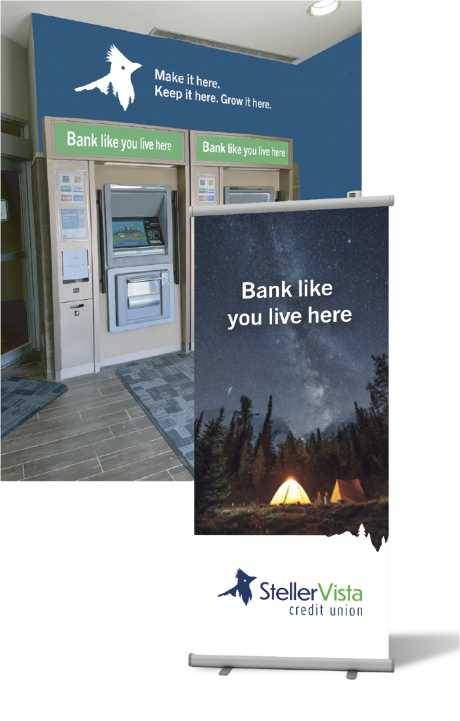
Where the brand meets real life
Visuals for in-branch moments that carry the tone and clarity of the new identity.
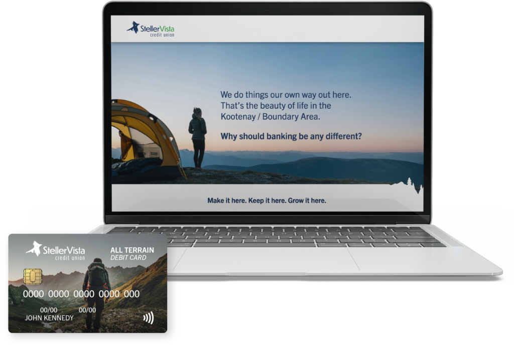
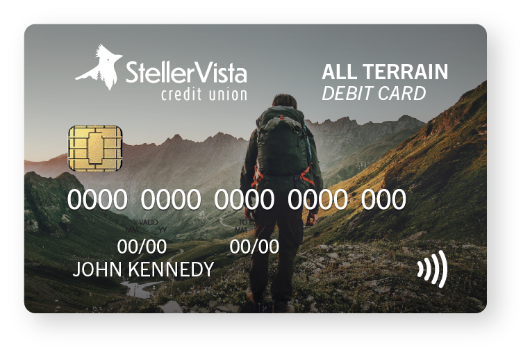
From branch to browser
Bringing the StellerVista brand into digital spaces with clarity and care.
Digital Ads
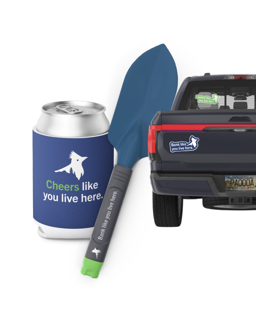
Like you live here
Apparel and swag designed to feel local, lived-in, and proudly StellerVista.